
The brief
The Style guide has existed for 2 years, but few employees are using it.
In NerdWallet, the style guide is a website for designers and engineers to learn the design system. As the company is expanding, the style guide becomes critical to achieve design consistency, and increase development velocity.
I joined the project to improve the style guide website with page templates redesign and launch the design in May. Meanwhile, I worked with the product owner to define the success metrics for the style guide to achieving the product value in the long-term.
Project Goal
Improve the page template design to make style guide useful for designer and engineers, and enable various content to grow over time

Component template evolution: The style guide has two types of template, foundations and component template. The component template is the focus in this project. Each UI component is one page, comprise of its usage, examples, and development content.
Design process
Research
Why not use the style guide?
From interviewing 4 designers and 7 engineers, I learned most users know the existence of the style guide. However, the disappointment made them leave. Some key findings are:
Most users come to the style guide for viewing component variations. However, scanning through the variations is tedious today.
The style guide is full of unnecessary content, and lacks of content which designers need
Poor usability decreases the site’s reliability
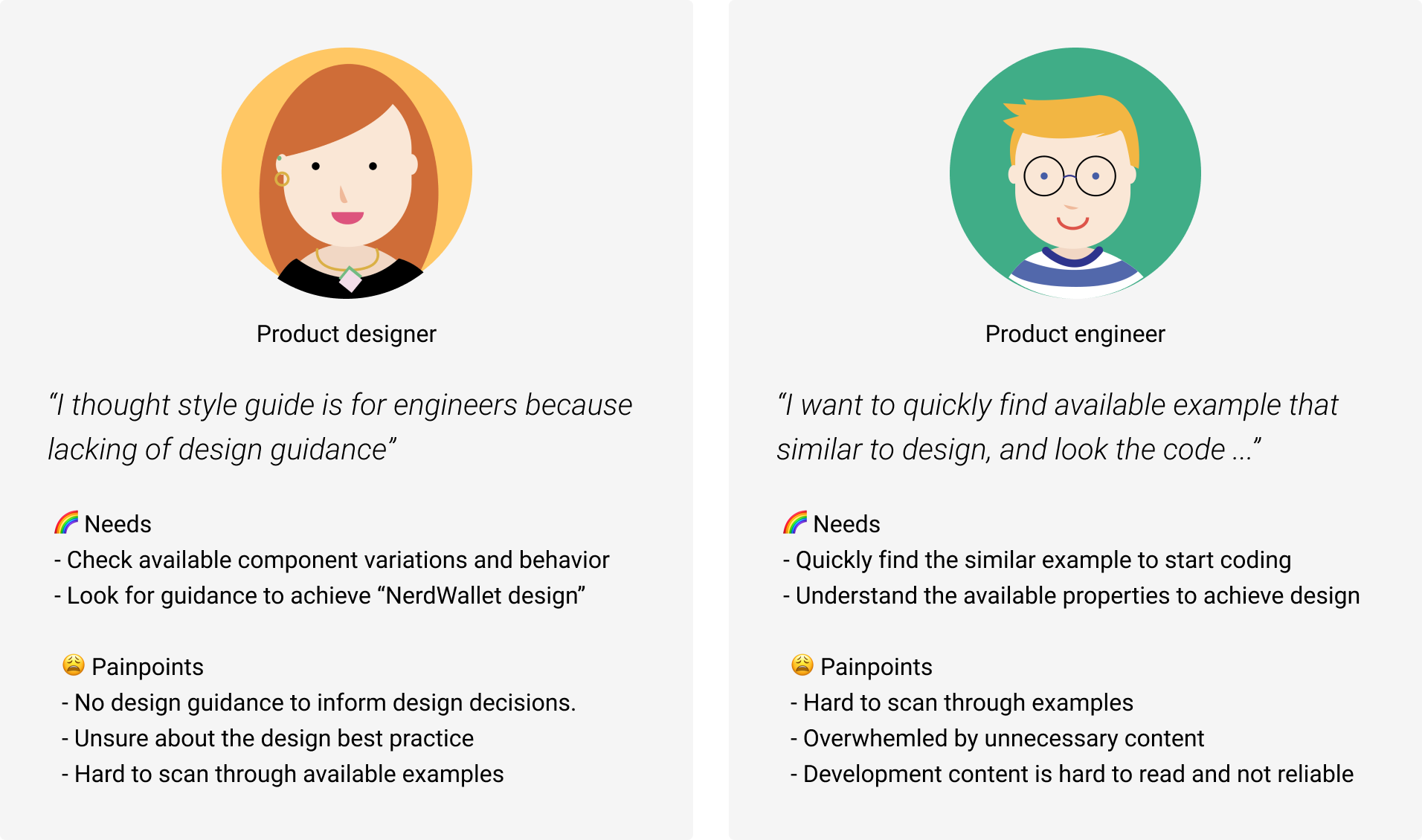
Personas - Product designers and engineers are style guides’ primary persona. The common job is browsing component variations.
Get buy in
Start with a simple but useful template
The search findings helped the the team to understand the needs and align on the direction:
Simple - remove unnecessary content as people don’t read.
Useful - make scanning component variations easier, and improve the experience on essential contents as below.

Essential contents to include and improve in a new template. The new template aims to start with “simplicity”. Therefore, we removed most of the content, and iterate what's helpful for users today.
design
Define the template structure
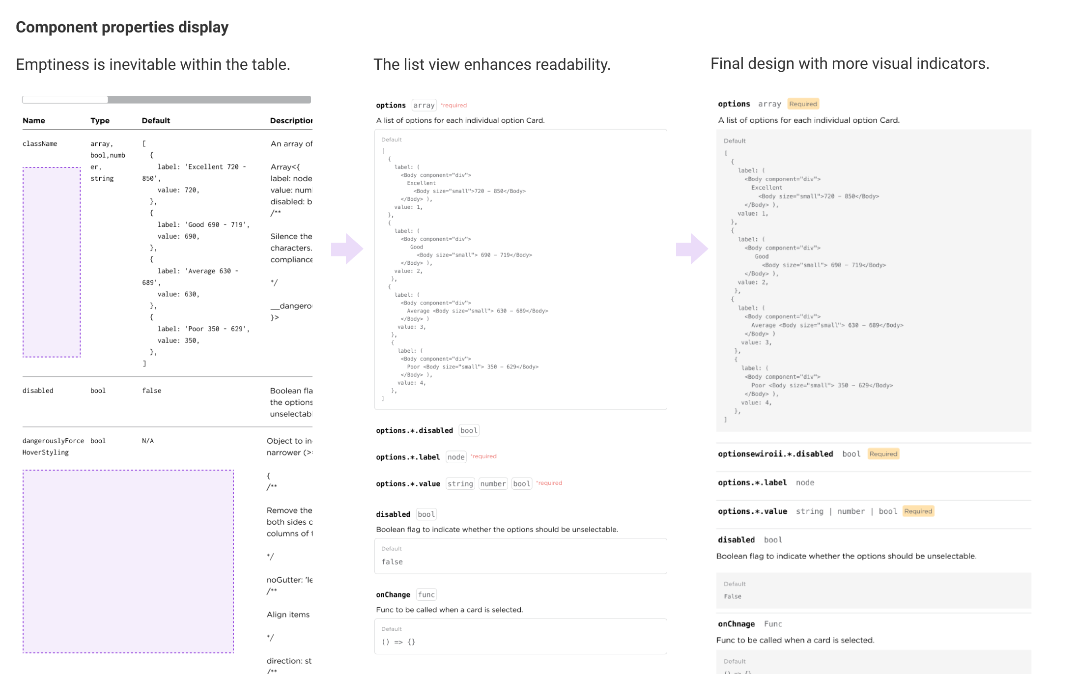
The newly designed structure should be able to be applied to different component pages and enable the information to be found easily. I started explorations from "variants display" and followed by defining the page structure. During design iterations, I tested the structure with different component's contents for scalability and got feedback from users and content strategist. Finally, the information is grouped based on persona and sorted by users' priorities.
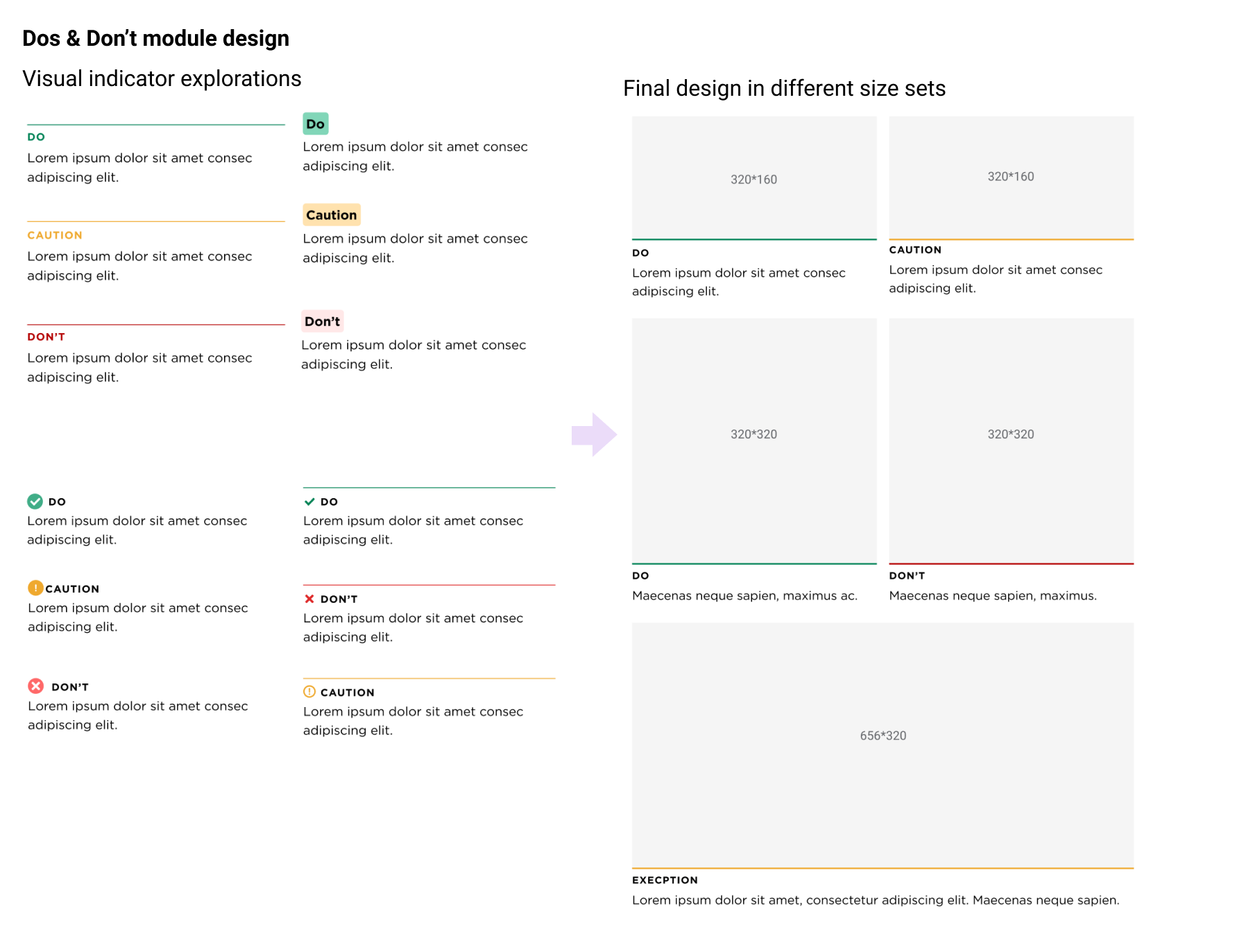
Left: Component variants display exploration. | Center: Persona based structure; the order is decided by usage. | Right: Polish section definition with content.
Hi-Fi Design
Hi-fi design evolution
The main considerations for hi-fi design are scannability, accessibility, and readability. Also, I am using components in NerdWallet design system to establish examples for design.
Component template highlights

Final design highlights for component template.
validation
Consider the future content
To validate if the Style guide could document various guidelines in the future, I worked with the design team to collect content ideas. Through ideas card sorting with other designers, we found the needs to document the guidelines beyond component level. Thus, a new template, “Pattern“, is created to include these guidelines.

Finally, the style guide has 3 templates to document various design guidelines - foundation, component and pattern.
Results
New style guide is launched 🎉🎉🎉
I continued working with the design team to add more design guidelines and implementing the design with engineers. After the release, I conducted post-launch research to evaluate the refresh work, some highlights are
The style guide’s weekly visit triples
80% of employees find the Style guide useful
The new component templates save more than 50% of the time for users to find component variants
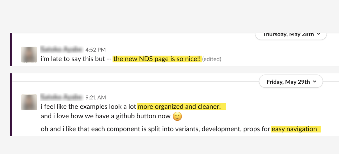
Messages sent by a product engineer about how she like the new style guide.
Success metrics, and next steps
To make sure the style guide delivers value to users, I helped the design system team to define the success metrics, so the team can keep tracking.
From current performance, “trust” and “usefulness” are areas that could be improved due to “discrepancies among resources” and “lacking design guideline”. The data motivated the product owner to make "source-of truth" as the goal for the next quarter. In addition, it prompted the design manager to encourage designers to participate in content creation.
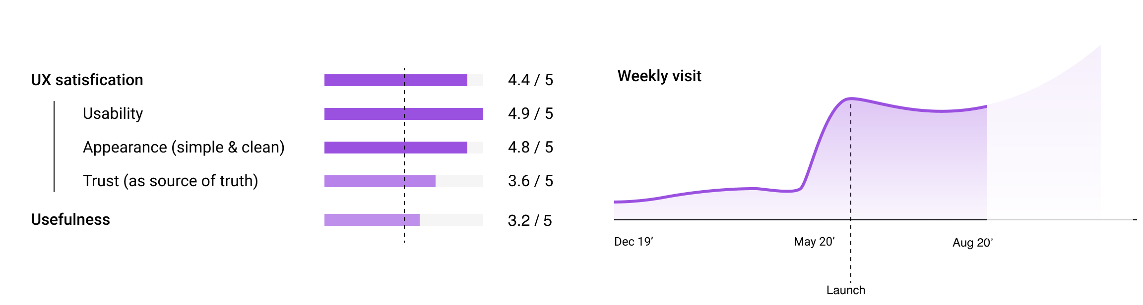
Style guide’s current performance - Key success metrics are : UX satisfaction, Usefulness, and weekly visit. While all the them pass the baseline, 3, Trust and Usefulness have room to improve.